
<Art Direction/Illustration/Animation><B2B>
From Cloud First
To Cloud Smart Explainer Campaign
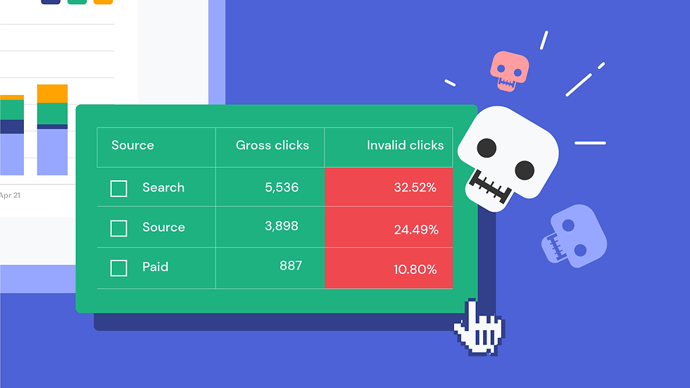
TrafficGuard is a digital ad fraud prevention platform that helps brands protect their marketing budget from fake clicks, invalid traffic, and poor-quality conversions.
The goal was to create a product explainer that helps audiences quickly identify ad fraud, understand how fake traffic impacts marketing performance, and see how TrafficGuard improves campaign ROI and trust.
Deliverables:
Explainer video
industriy:
MarTech | Cloud Computing | SaaS
client:
Tata Communications
Scope of Work
I led the creative direction and end-to-end production workflow, from script approval to delivery. My role included moodboard research, visual style exploration, illustration and animation direction, style frame finalization, key animation planning, client discussions, feedback management, animation review, and final approval.

Moodboard exploration
We have explored different styles for this unique project. We want to make it stock image-based but also quirky in nature. We have come across pop-up illustration and editorial photo bashing styles, along with patterns, vectors, and illustrations, which I think will be best suited for this story.

Key styleframe


Design Approach
The visual direction was kept clean, minimal, and story-driven. The goal was not to show too much information at once, but to guide the viewer step by step.
-
To make every frame easy to read
-
To highlight one key message at a time
-
To support smooth storytelling
-
To keep the animation clean and focused
-
To make the video work well across website, social media, and sales presentations
Why flat illustration worked
-
It made complex ideas more approachable
-
It kept the visual style clean and lightweight
-
It made the video feel modern and digital
-
It avoided unnecessary realistic detail
Reason behind minimal UI
-
To avoid confusing the viewer with too much technical data
-
To keep the focus on the product benefit, not only features
-
To make the interface feel clean, professional, and enterprise-ready


Add a Title

Marketing lookbook Project
Other work

Marketing lookbook Project